Bringing back the one-step bill-pay shortcut clients lost, right where they bank.
3rd
Most-used feature on the Accounts page after launch
100s
Of payees a single client may manage
2
Rounds of moderated usability testing
9 mo
End-to-end engagement, strategy to hand-off
01 — The Brief
A bank for clients who manage hundreds of bills, with no fast way to pay them.
Role · Scope · Team
The institution serves high-net-worth individuals who may hold anywhere from a handful to several hundred payees. My brief was deceptively small: create a quick, useful way to pay a bill straight from the homepage.
As the lead designer, I owned the work end to end, from framing the problem and running the research to delivering the high-fidelity designs for development. Along the way I used the evidence I gathered to make a larger argument: that the entire desktop payments experience deserved a revamp.
The reframe
What started as a single homepage card became the business case for elevating desktop payments altogether.
02 — The Opportunity
Three questions framed the work.
User & business impact
User impact
How might we let clients pay their bills seamlessly and efficiently?
User impact
How might we help clients navigate through hundreds of bills and payees?
Business impact
How might a quick-payment feature grow and retain online banking clients?
The before experience
Quick bill pay used to exist, until a platform migration quietly took it away. Five frustrations defined the state we inherited.
01
A shortcut that vanished. Quick bill pay lived in the legacy app. When that app was decommissioned, the feature was never carried into the new experience.
02
Two products, one task. Desktop ran on a third-party service in an iframe; mobile was a custom build on the same APIs. The inconsistency confused and upset clients.
03
Payees without end. A list of potentially hundreds of payees, with no way to search or filter through it.
04
Accounts without end. Likewise, hundreds of accounts to pay from, and no easy way to move through them.
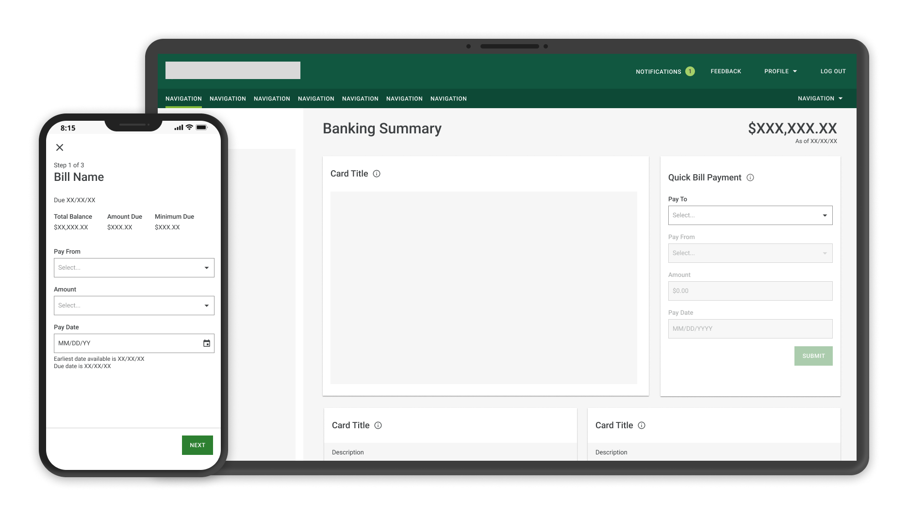
05
Buried action. To send a payment at all, clients had to scroll to the very bottom of the page to find the ‘Send Money’ button.
Item 03Endless payee list, no searchItem 04Endless account list to pay fromItem 05‘Send Money’ buried at the bottom
03 — Discovery
I started by learning what good looked like.
Competitive analysis
To set a baseline, I ran a competitive analysis of five banking and payments products. I built comparison matrices to structure what I found, then packaged the takeaways and recommendations into a presentation for the wider product team.
The analysis did two jobs. It directly informed the design decisions ahead, and it gave me the evidence to argue for something bigger: bringing the desktop experience in-house, replacing the third-party iframe with a custom build consistent with mobile and aligned to current industry standards.
Strategic outcome
One feature's research became the case for a full desktop payments redesign.
With the user feedback and competitive insights in hand, I moved into exploration, iterating quickly across structure and UI before committing to anything for testing. Two directions led the way.
Iteration 01Exploring a flow built on modalsIteration 02Card designs — testing organization & UI
05 — Research & Iteration
Two rounds of testing. Every change earned its place.
Round 01 → Round 02
Because this feature would live on the homepage, we invested in moderated usability testing. Working with a researcher, I prepared the wireframes and we put them in front of clients — watching whether they could complete a payment, and where they hesitated.
Round 01 · what we heard
5 of 5 participants needed a hint to find the Bill Pay card. Every one of them asked for fewer steps and fewer clicks.
The signal was unambiguous. Discoverability and speed weren't polish items; they were the whole job. The clients' own words made the priorities impossible to ignore.
“
It was just up at my right-hand corner before. Why is it at the bottom there? I'd rather see it more prominent somewhere.
Participant · Round 01
“
On the old system I didn't have to go into a payment. I'd just click, fill in the payee, the amount, the date, and I'm done. It was a shortcut, and I missed that.
Participant · Round 01
“
I could go down to Bill Pay, but that doesn't really give me easy access to pay a bill really quickly.
Participant · Round 01
What I changed, and why
Four decisions came directly out of Round 01. Each one maps to something a client said or struggled with.
01
Insight
All five participants needed a hint to find the card.
Decision
Move it to the top
Promoted the Bill Pay card high on the homepage to make it the first thing clients see.
02
Insight
Everyone wanted fewer steps and fewer clicks.
Decision
Collapse the flow
Replaced the modal flow with a single card driven by dropdowns, so clients pay without leaving the page.
03
Insight
Hundreds of payees were impossible to navigate.
Decision
Split ‘Pay To’
Separated Bills and Payees into two clear sections so clients could find the right one fast.
04
Insight
Clients needed reassurance the payment went through.
Decision
Confirm clearly
Designed a success screen that surfaces the confirmation number front and center.